Louise Josephine Bourgeois- Maman 1999

Louise Bourgeois, Maman, 1999, cast 2001. Bronze, marble, and stainless steel, 29 feet 4 3/8 inches x 32 feet 1 7/8 inches x 38 feet 5/8 inches (895 x 980 x 1160 cm)

Louise Joséphine Bourgeois was born december 25th ,1911 and died on may 31st, 2010. She was a french artist that got her start in Paris and lived the last years of her life in New York at the age of 98.

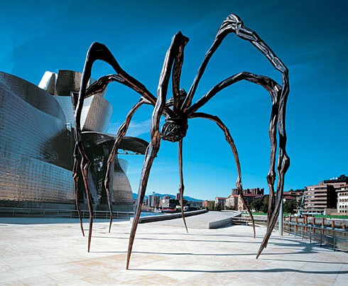
Her work, Maman, made in 1999 and cast in bronze in 2001 was a public artwork that was displayed in multiple locations. Locations such as the Guggenheim, Argentina, Sweden, Canada, Germany, Mexico City and many more. Out of most of her artwork, Louise Bourgeois pushed past her limits and made a sculpture that stands at a height of thirty feet. The most interesting part of the sculpture is the idea of having something that is normally small and can fit in the palm of your hand, to something that is taller than the average human and makes you look up. The only possible way of seeing the sculpture in all of its glory would be to go into a building higher than the sculpture and look out the window to see the work from the top. While the artwork does take the average spider and make it larger than life, it still has that creepy factor that most would feel if they came in contact with such an insect. I personally find the idea of a large spider in front of me terrifying and unnatural from the usual ones you would find in your home.

Another interesting quality is the personal aspect Bourgeois brings to her work, Maman. While most artists add a personal background to their work, Bourgeois specifically talks about the spider as the representation of her mother. When we think of a mom, we think of someone who is nurturing, caring, protective and always puts your safety above their own. That was exactly what the artist’s thought process was during the building of such a large sculpture. She thought of her mother as a protector, the spider’s body which is filled with eggs are protected and symbolize motherly instincts. To protect one’s child from harm. Bourgeois choice in material, bronze, marble and stainless steel are all materials that consist of strength and durability.

While I have not seen this work in person, its current whereabouts are unknown (at least to me). I would still highly recommend seeing this piece in person to gain the full effect of what the artist had succeeded in representing her mother.


Jack Whitten- Technological Totem Pole 2013

20181102_104612

20181102_10463020181102_104700

Walking into the Met Breuer was a sight to remember. Specifically, the Jack Whitten exhibition. As you enter the floor of the exhibit, you immediately see this wall with his name, sculpture and the years from when he was born to the year he died. Taking a closer look into the exhibit, space opens up with a mixture of sculpture and painted work. Not one piece failed to impress and was presented on a pedestal or on the wall. It was very easy to follow since this museum placed a well-designed card with a description, the name of the piece and what the artwork was made out of. Where some people may read the description and glance at the work before moving onto the next one, this work is something you just cannot do that with. Each work was executed beautifully with the use of various materials in different sizes and forms.

What I found most interesting about the artist, Jack Whitten was that the work seen in this large room had been work that most people had not seen yet. To know that every summer, he would go to Greece and just build sculptures, then leave the artwork there for years was a surprise. However, the wait for such artwork was well worth it. One piece, in particular, had caught my eye and that was the Technological Totem Pole. It was made in 2013 and was made out of black mulberry, metal, Gortynis marble, Braun alarm clock, and mixed media. The first thing that caught my eye about this particular piece was the variety of technological devices such as a cell phone, alarm clock that is actually functional, a fan, a remote, wires, batteries and more. It reminded me of how much technology we use in today’s society and how reliant we’ve become. However, it also shows the progress of technology due to the cell phone is seen in the work is a flip phone. Jack Whitten had wanted to show the past, present an future of technology and I believe he had portrayed it well. The various wires placed on the back made the work feel alive as if it was pulled from a much larger device and placed on display. The totem pole itself could be dated back to the Northwest Coast Native Americans to which it spread to another tribe as a way to tell a story or represent a hierarchy. Even though technology has continued to progress, it was interesting to see technology that was used a long time ago.

In my opinion, the Met Breuer is a museum that I would recommend visiting and specifically visit the Jack Whitten Exhibition. You will not be disappointed.

Isamu Noguchi- Floor Frame (Remembering India) 1970

680


A trip to the Noguchi Museum is a place worth visiting again and for those who have not experienced it for the first time as well. This museum, in particular, differs from the Museum of Modern art and the Metropolitan Museum for three reasons. One, the work of art placement is solely based off of how the artist wanted them to be placed. I think it is wonderful to walk into an exhibit with the knowledge that the artist themselves had taken the time to position their artwork the way they wanted it. Two, the layout of the work of Isamu Noguchi. As you walk in through the main doors and then walk to your left through the next set of doors, the first thing you notice is the change of scenery; specifically the architecture. An indoor/outdoor exhibit is a different experience compared to the elegant and formal presentation of a gallery such as the museums mentioned above. When you walk into the Noguchi Museum, the indoor/outdoor feel as if you are actually outside and experiencing the artwork in its natural place. The artwork itself represents the theme of the indoor/outdoor exhibit by the way he cuts into the rocks and the manipulates the surface to show the inside/outside of the rock. The theme of the museum connects with the artwork very well which is something you don’t always see in some museums. Work made from natural resources and then used architecturally shows how there is more than one way to use materials within our society, no matter what the actual use of it may be. Lastly, Isamu Noguchi purposely left out the plaques that would normally give you the title, what the artwork was made out of and a small description of what the work was about. His vision of his museum was for the viewers to walk in and focus on the artwork instead of looking for a description of the work. Like the MOMA, but different by there is no description of the work, only what the viewer thinks the work is about.

Amongst all the amazing and inspiring artwork, one piece stood out in particular and that was the Floor Frame (Remembering India).  It was made in 1970 out of yellow Sienna marble and petit granite marble. I appreciated the way the piece represented movement and play of scale. It was interesting to see a work of art so low to the ground, but I couldn’t imagine it on a table or even on a pedestal. It was wonderful to see the playful illusion of the artwork. It was like a part of the work went into the floor and came up and came alive with plant life. It reminded me of how as humans, we tend to lay our roots into new places with the idea that we are going to be in that place for years and grow old there. The work together was peaceful to look at and interesting to think of what the meaning was behind it without looking at a description.

I would recommend this museum to anyone after the experience I had for the first time and plan to go again.

Brancusi- Endless Column version 1, 1918


cri_000000313857

Visiting the MOMA for the first time, I had the pleasure of being able to see the Constantin Brancusi Sculpture exhibition. An artist who used not only one, but four different types of materials: wood, marble, limestone, and bronze in his artwork. Brancusi also designed the bases of the sculptures to be a part of the work instead of resting the work of art on the same base for all of his work. This kind of style allows each piece to be unique and for the viewer to take notice of the shape and design of the base. For some artist, a maquette or sketch of the idea is planned out before completing the artwork. However, Brancusi was one of the few who didn’t plan out on paper but started working immediately, his whole plan in his head. As a college student in art school, I couldn’t begin a project without putting my plan down on paper or make a small version of the idea first. Even after I had everything planned, I still continued to change the idea as I progressed in my work.


Walking into the exhibition, the first thing I had noticed was the size of each sculpture compared to what is seen when you open a book. I particularly found it fascinating to see the Bird in Space in person because the artwork seemed so small in an art history book. Second, I noticed the location of the descriptions of the sculptures were not beside the artwork but placed on the wall at a reasonable distance from the art. I found this to be a great place for the descriptions to avoid the viewers from reading about the work and then moving on. In the past, when visiting other museums, I would see people read the description first or search for a description before taking a moment to look at the art in front of them. Lastly, I noticed the layout of the sculptures that allowed for a 360-degree view of the work. In many cases, I’ve seen work placed against the wall or side by side, preventing the viewer to see the work from all points of view. It’s important to see a work from all sides in order to get the full effect of what the artist went through in completing the work, such as the variety of marks or textures used.


One piece, in particular, stood out to me amongst the artwork and that was the Endless Column. Made in 1918 and carved from wood, specifically oak. This artwork caught my interest because it was a series of shapes that were stacked on top of each other and looked as if there was no limit to height. Just looking at the piece, you could imagine the work continuing on to heights that even a human being couldn’t reach even with the tallest ladder. The Endless Column reminded me of how certain things in the world are endless no matter how many years pass, such as the earth and the universe itself. The different marks made from carving into the wood were interesting, including the visible wood grain.

Alexander Calder- Ordinary

Alexander Calder has been one of my favorite artists since the beginning of high school. His use of kinetic art and the creation of the mobile-inspired multiple projects and lesson plans that I have made in the past. I have always been interested in moving artwork since it brings the artwork to life in a whole new way. To be able to stand and watch the art move instead of moving yourself gives the feeling that the artwork itself is alive and gives the viewer different ways to admire the sculpture. Calder’s sculpture, Ordinary, was made in 1969 and was created by the use of paint, rods, bolts and sheet metal. I was drawn to this particular piece by where the artist had chosen to install it. I have lived in New York for most of my life and enjoy seeing the many works of art that are installed all around such as the variety of artwork displayed around the Pratt Institute campus. To place a sculpture outside instead of in a museum leaves the piece exposed to the seasons, variation in weather conditions and allows people to get up close and touch the piece, whereas a museum wouldn’t allow people to get too close to the artwork. Displayed outside in an open field draws the viewer’s attention specifically to the artwork. The use of color and size compared to the green of the trees and ground and blue of the sky makes the sculpture stand out.

Colors such as red, yellow and blue give the sense of playfulness and fun, which young children would be drawn to.  Calder’s artwork had also caught my interest because of the way he shows that art does not have to up against a wall, hung from a ceiling or placed on a pedestal for all to see. His work breaks away from the typical placement, such as a gallery and allows a new way of looking at the artwork. The artwork shows balance through the use of metal which is a nice material to work with. The material brings back memories of when I was first exposed to using metal to create art. It holds shape and has enough strength to hold the shapes that are suspended in the air, but proper safety is required to avoid hurting yourself. I find it important that a sculpture has balance so artists don’t run the risk of having their work collapse or lean-to one side unintentionally. It’s a sad day in an artist’s life when they spent hours on a piece, only to have it fall apart when they were close to finishing it.

A01218.1